It should come as no surprise that I get very excited about fabric. I've been sharing what I buy, stitch and make here for over seven years. The colours, prints, the way it handles, the endless combinations... fabric brings me joy.
The opportunity to get to chose and work with fabric is truly something special. I SQUEALED a lot when these beauties I picked arrived from Freespirit. Vibrant, rich, bright, happy colours of Designer Essentials Solids:
top row: Cosmo, Melon, Pomegranate, Gold, Tropical
bottom row: Serpent, Clearwater, Julep, Citrine
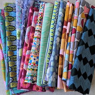
I selected fabrics from Anna Maria's Conservatory Chapter one fabric range. The five prints on the left are from English Summer by Anna Maria Horner, the three in the middle are from Savernake Road by Monika Forsberg and the five on the right are from Vestige by Bookhou. While they are three separate collections they do play well together and I like the mix of styles, it keeps things interesting!
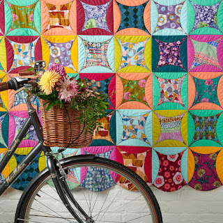
This quilt was a sample for Love Patchwork & Quilting, the pattern is by Laura Pritchard. A sort of Rob Peter to Pay Paul design, that uses quilt as you go and is similarly tactile to a Cathedral Windows pattern. So I got to work, cutting and more cutting until I had a stack of round sandwiches...
Then sewed, sewed, sewed to make what can only be described as a bit of a mess! My husband was very bemused.
Though at this point the back of the quilt was looking AWESOME! Very Elmer the elephant. The solid colours look so pretty and I really like all the curves along the edges of the quilt.
The next step is stitching down the 'petals', topstitching and quilting simultaneously, and it's here that you really see the quilt taking shape. I quilted this in the same way as an orange peel, going vertically in S shaped lines and then horizontally with the same S lines.
I used Aurifil 50wt for sewing the circular sandwiches and piecing them together, and then 40wt for the quilting - both in shade #2930. This shade could easily be overlooked (some may deem it too brown) but it's a beautiful golden toast shade that blends in and worked perfectly with all the colours I used in the quilt.
This is a weighty quilt because of all the layers and finishes at 72", with those whimsical curvy edges all the way round.
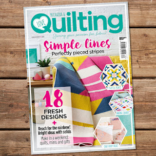
You can get Laura's pattern and see more pictures of my quilt in Issue 70 of Love Patchwork & Quilting, out now!
Randomly last night I realised my (now 6 year old!!!) daughter knows all the words to Wonderwall and after the cutest rendition, she told me that I'm her Wonderwall ♡♡♡


14 comments
Post a Comment
Love this quilt and you certainly brought the pattern alive. What a lovely daughter you have.
Thank you so much! I do, I'm very lucky 💗
Looks fab Lucy, always a pleasure to read your blog :-)
Oh wow, this is amazing. i love a good burst of colour. x
Great to see I just love this quilt! So want to make so add to the list
Wow! This quilt is absolutely gorgeous. I love the colors and the way you've mixed the collections. Really shows off well! Now I'm tempted to make one =)
This is such a vibrant quilt, love the curved edges on it. Good to know about that thread colour blending so well with the colours, sometimes it is really hard to work out what thread colour will work best on colours.
Truly lovely. Diane
This is such a gorgeous vibrant quilt Lucy! I love how this is put together - so very cool!
I just love the combination of colours and the pattern you have created.
It makes me smile every time I look at it.. Thank you for brightening up February. I loved reading about the creative process that brought this quilt to life.
I love your colors. Thanks for showing pictures of the process!
I didn't realise it was YOUR quilt I had been gushing over!
That's so sweet!! Thank you 😄
Lucy, this is gorgeous!! So there’s no cutting open of the windows? I’ve always loved the cathedral windows look. What a cool method!